The Art House: The Movie Posters of 'Star Trek'


Rotary phones. Turn dial TV sets. Card catalogs. I’m old enough to have been on the receiving end of some humanity’s more antiquated technological innovations, and their growing pains. Most generations go through this. Just ask that slowly decaying relative of yours that preaches incessantly about how things were when they were young. Past all of their tales of snow-covered soleless shoe adversity often lies a yearning for the past, something tangible and real but also betraying of memory. Suddenly we’re older, nestled in our elder’s recliner, looking back through rose colored glasses and pining for the way things used to be, not fully understanding the way things are or remembering how they were. Thing’s aren’t the same, but what’s really changed?
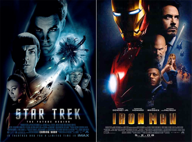
Star Trek has, and the best of both worlds scenario you dreamt of as a kid seems to have taken place: what you enjoyed is shared and liked seemingly by everyone, rather than being the thing that gets your school books knocked to the floor. Friday sees the second installment of J.J. Abrams’ popular space faring franchise opening in theatres after months of intense marketing, which kicked off with a poster that drew more than a few comparisons to that of a previous summer blockbusters. Originality aside, a mangled Starfleet insignia managed to convey more thought and elicit more emotion than the work that followed. Unfortunate, sure, but disappointment is often felt when reflecting on the state of modern movie posters. What puts Star Trek in a unique position is that its long history within cinema has brought a host of admirable work from a few of the industry’s more gifted craftsmen. Higher expectations are unsurprising. But like anything else, though, the franchise has showcased some particularly unfortunate instances of poster abuse. The past is rarely as clear cut and beautiful as we remember it being.
From 1979 to 1989, American artist Bob Peak beautifully rendered key art for five out of six of the original classic-series Star Trek films. Having made a name for himself prior for his work on My Fair Lady and Camelot with designer Bill Gold, Peak’s output gave rise to his status as an influential father in the creation of the modern film poster. Whereas other designers or agencies joined copy and still photography to grab a viewer’s attention, Peak, a self-described craftsman, illustrated and painted layered collages that drew you in through their rich use of color and compositional placement. They play to tone and scene, channeling an atmosphere that unfolds over the journey taken by each film’s story.

And that was perfect for Star Trek; the franchise has strength in its interplay between unique depictions of space exploration and alien worlds with its characters that serve to give those wonders purpose. Bringing that to the attention of an audience asks for more than a witty tagline, some enlarged still photography, or a clever execution of form as symbol (the Saul Bass work that you’re undoubtedly familiar with wouldn’t fly here). It can be done, but you lose something in the process: the deft hand of craftsmanship that sets up a world that you can feel and get lost in. The vastness of space punctuated by a curious use of color. The looming figure of a titular character awash in the place that seeds his desire for revenge. A small group, far from home, searching for a lost friend. Our own backyard, seen from the clouds. We can debate the use of floating heads some other time, but what remains are five well-made paintings, with a sixth, equally strong effort from John Alvin; all of which prepare us for the stars.

But, rose colored glasses. Much like today, campaigns offered up more than a single visual representation for its star attraction, and these alternate takes were used in conjunction with the pieces we remember being the sole arbiters of a film’s identity. And occasionally a piece of connective tissue remains between the two. For all it’s majestic beauty, Wrath of Khan sports a title treatment that appears actively at odds with the rest of the composition, damaging any illusion of uniformity. It’s shoehorned in, feeling more at home surrounded by block after block of still photography found in the second, alternate poster.

Search for Spock found itself the victim of marketing mandates, with Peak’s painting unceremoniously cropped and placed within a frame before being lathered with text. The art itself remains visually stunning, but almost completely neutered here thanks to the cage it’s been imprisoned in. A simple, more direct take from the same era by Gerard Huerta was mercifully spared, carving out a space for itself through clarity rather than being all that remarkable visually.

While Peak’s future contributions remained unsullied, two of the most inexplicable instances of marketing gone awry owe themselves to The Voyage Home and The Final Frontier. Words are hard to find here, as the former illustrates a screwball time-traveling buddy-comedy from space while the latter borders on bad promotional parody. They’re completely divorced from expectation, yet they manage to be somewhat appropriate. Voyage Home is a bit of a joyous romp, and Final Frontier is a bit of a head scratcher, so surely we’re not too far off from seeing a rational response to a well considered brief... Never mind. I think I need to lie down.

1991 saw John Alvin take Bob Peak’s place for the final film featuring the classic series crew. Things were changing. A burgeoning aversion to painted pieces by studio executives and marketing teams took hold in the mid to late 90s, marshalled on by the idea that the audience themselves preferred and gave their business to films backed with still photography. Modern advancements became heavily relied upon while more traditional methods fell by the wayside. An oddly fitting time for a transition, as the next generation of Star Trek films focused on the modern television cast, striking out a new identity over the course of four films. The worst that can be said about the work that was born from this shift is that some of it was dull, while the best did what it was designed to do, and not much else.

Generations offers a shift in color palette, casting space and a transparent Starfleet insignia in a sea of blue and purple. The lens flare is overdone, and there’s no real world building here, but an effort was made at being honest about the novelty of the picture: a new series of films, changing hands from one generation to the next. Floating visages of the central characters carry themselves over from the Peak era, and continue to do so in the art for First Contact, which lifts the motif of three characters superimposed in a beam of light from The Motion Picture while finishing off it’s remaining structure by mirroring elements of the key art from The Final Frontier. It’s a little pastiche, and a bit unevenly handled, but it does it manages to do its job without embarrassment.

The same can’t be said for Insurrection and Nemesis, the final two films before someone had the good graces to throw everything out and start anew. The former, while eye catching, is an empty vessel, checking off the few things that someone would ascribe to Star Trek: space, planet, spaceship...ominous alien? It’s attractive but shallow, bereft of a clear journey that it should be imparting on the viewer. A success, though, next to its predecessor, which suffers the unfortunate fate of not only having little to say but comes dangerously close to embodying the snide remarks commonly made at the state of modern film posters. Twenty-three years of art for a culturally relevant science fiction franchise pauses here with some green space clouds and a bald shadow with a knife.
I lied. I guess dull isn’t the worst thing you could say about the final art for Nemesis. But I think that gets us to where we need to be: the present, and a rebooted franchise that acknowledges its past while looking ahead to the future. A modern day blockbuster with a designed-to-sell campaign to match. They’re polished and formulaic, an approach that feels like it could be replicated across any number of tentpole films. And that’s because it has.
Actors and a brand name are being sold - no different from any other point in history - but within the history of Star Trek, what we’ve been concerned with here, things have changed. The franchise reaches a bigger and broader audience than it once used to, and with that comes a built-in hype machine, one that guarantees box office success. But there are no creative leaps forward for advertising: more money is spent, yet the work itself becomes safer. Maybe it’s because a large picture of an actor tracks best? Maybe it’s because a poster doesn’t occupy the same space that it used to: narratives can be forged in any number of different ways now thanks to expanding media markets. A poster just needs a name and a face - a reminder for elsewhere. That large sheet of paper is a technology that’s been stripped of it’s power by the people creating it and the people paying for it. Sure, there were missteps in the past - things are rarely as wonderful as we remember them - but art and commerce begrudgingly worked together, giving us more good to look back on than bad. What good do we have to look back on here? Not much aside from a surprising monochrome spaceship.

It’s not that Star Trek or Star Trek: Into the Darkness champion bad design, because the work itself isn’t that at all. You know bad design when you see it: it usually stirs some type of emotion in you. This isn’t that. There’s just little emotion to be felt from most of it aside from exhaustion at being fed the same meal time and again. Peak may have had a style, and that might’ve constituted a brand, but a willingness to explore what those things meant bore out a decade of engaging imagery.
Boldly going where everyone has gone before. That’s Star Trek’s present, but it doesn’t have to be its future.